Tess Newspaper
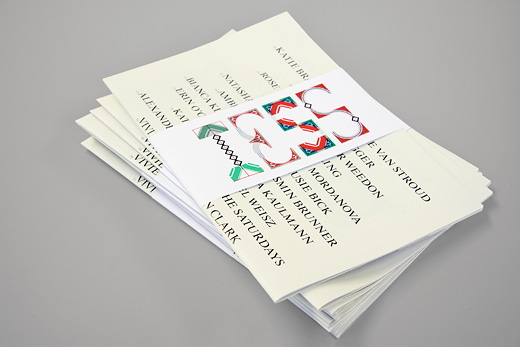
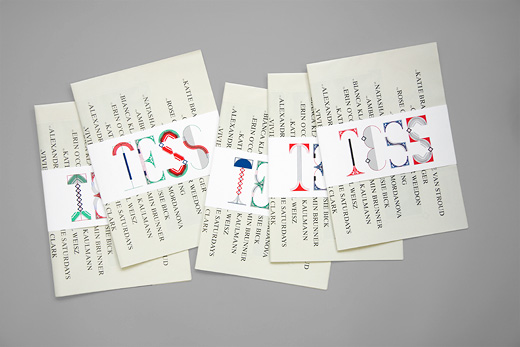
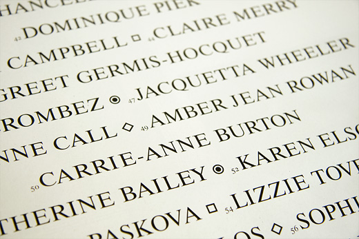
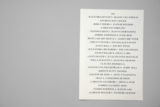
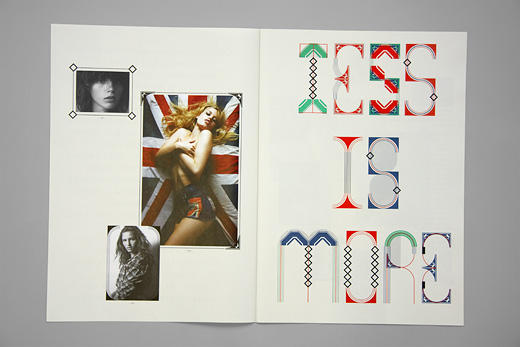
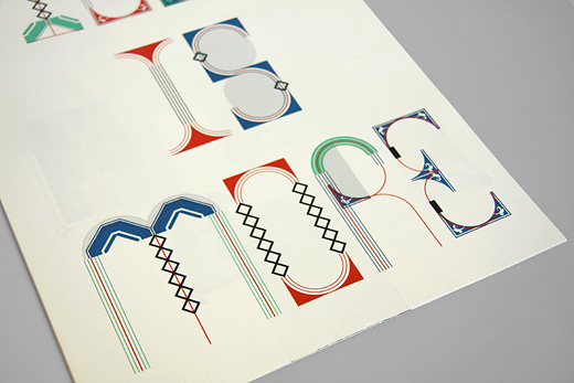
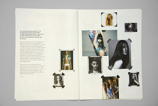
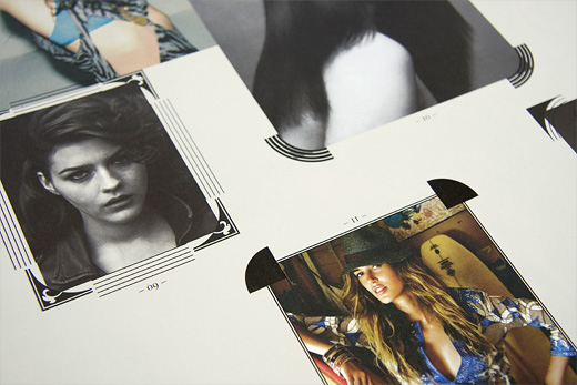
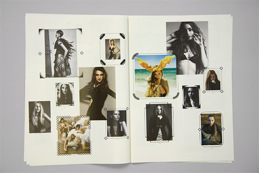
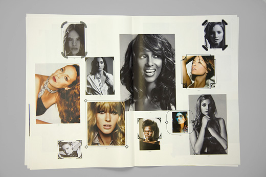
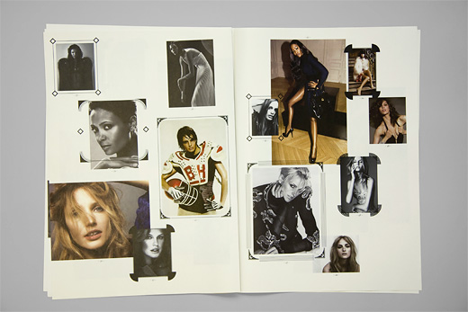
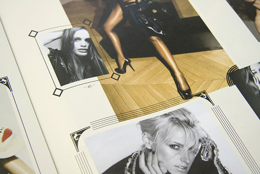
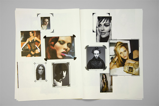
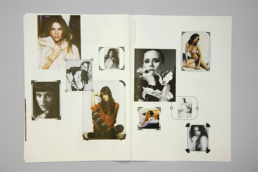
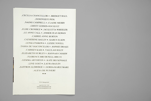
Beside other material such as model cards, portfolios, folders and stationary we designed a newspaper to announce the launch of the new agency. The newspaper folds to an A4 format, held together by a belly band. To show the variety in the logo we printed different versions of the bellyband. 'Tess is More' not just relates to the agency but is a rather ironic statement that could be seen as our break with the modernist tradition of 'Less is More' and our growing interest in ornament and decoration.
→ Tess Management in the identity section
→ Tess Management in the web section
