Cupcake
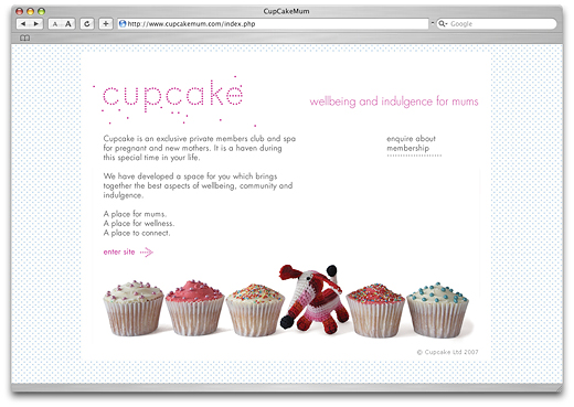
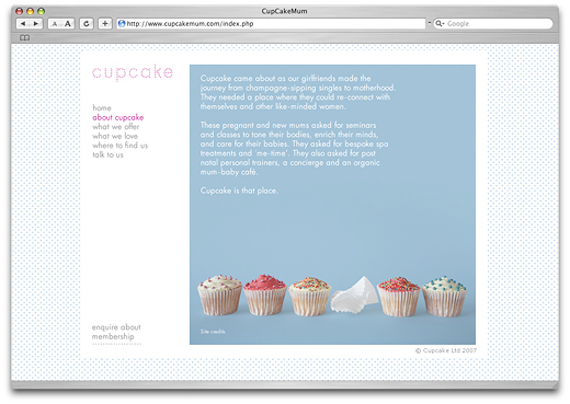
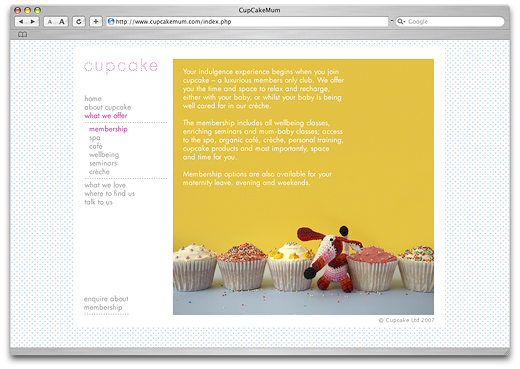
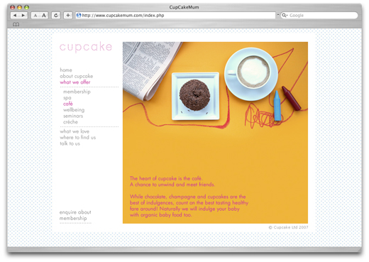
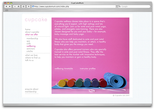
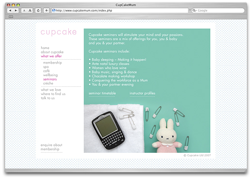
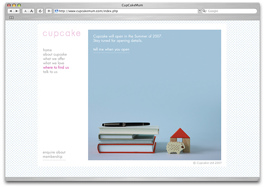
We designed a small information website for cupcake prior to the opening. Since there were no photos of the actual space available at the time we used the same images as in the brochure. The photo concept was simple: everything had to be shot like in a child's drawing, either straight from the top or from the front, without any perspective distortion. The cupcake logo featured a little animation with changing dots. This initial website is no longer online as cupcake has by now already opened its second premises and a third one is in planning.
→ Cupcake in the identity section
→ Cupcake Brochure in the print section
