Circus
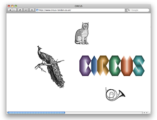
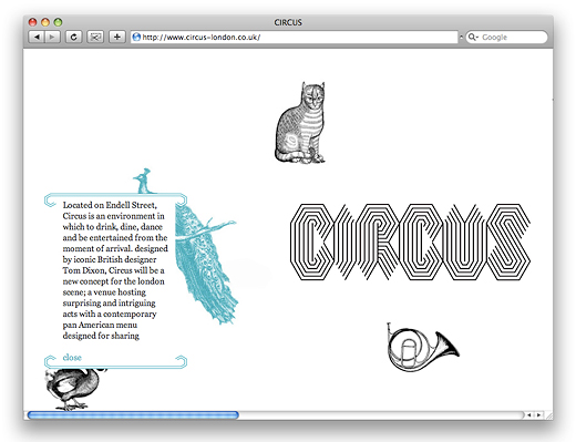
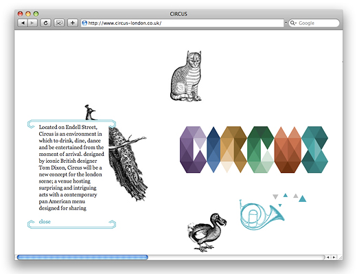
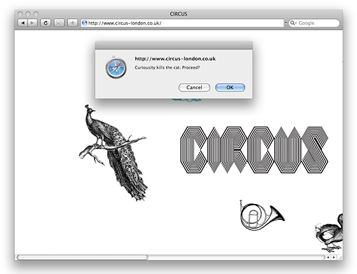
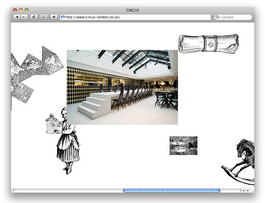
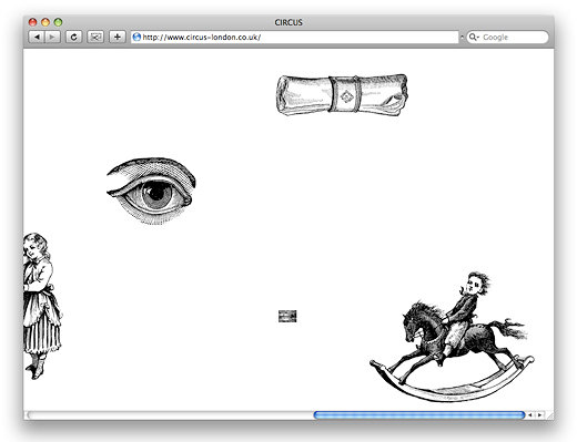
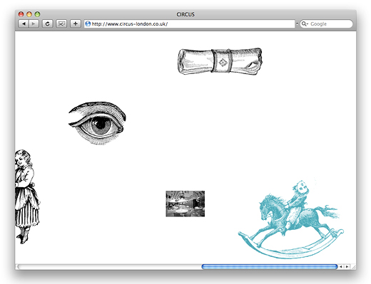
When Circus opened we designed a temporary holding page. The small website encouraged users to scroll through a number of surreal animations and links: thumbnails which get smaller when you click on them, slideshows which run too fast to see anything, pointless fill-in forms, etc. The site has now been replaced by the official Circus website which is not done by us but took some inspiration from its crazy predecessor.
→ Circus in the identity section
→ Circus Mini Brochure in the print section
